I had a familiar idea: create a clear landing page to promote an event I’m planning for business leaders. At the event, we’ll teach them about AI-powered tools for managing digital marketing at their companies. I wanted first-time visitors to understand what I’m offering within seconds, see examples, and know what to do next. The question was how much work it would take to turn a rough idea into something I could share.
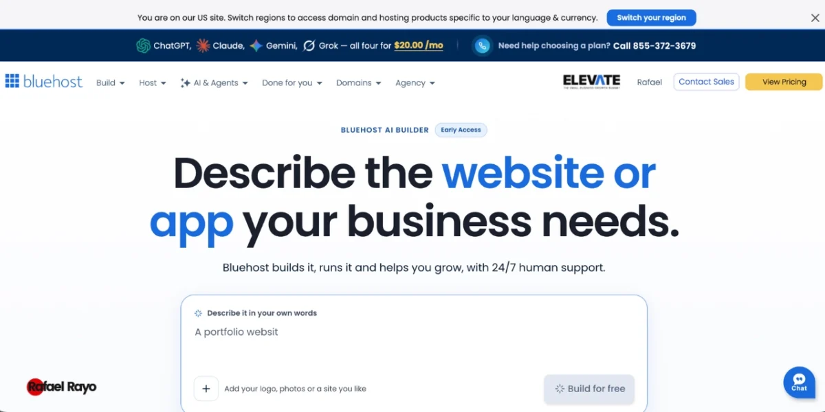
I tried Bluehost AI Builder with that question in mind. The idea is to describe the site you need, answer a few questions, and then request changes by chatting with the tool. In my case, I started by creating a landing page for the event with the basic requirements. I didn’t have to start by choosing a template or writing code. I explained the goal first, then reviewed what it generated.
To give it context, I wrote a prompt with four elements: what the project is, who it’s for, what information the page should show, and what I want visitors to do next.
In my session, I wrote: “I need a landing page to promote an event I’m planning for business leaders. At the event, we’ll teach them about AI-powered tools for managing digital marketing at their companies. It’s a one-day event and includes admission, lunch, a networking session, a Q&A and case studies session, event materials, and a certificate of participation. Employees, independent professionals, business owners, department directors, and team members can attend. We’ll have live demonstrations, case studies, and metrics. The event will take place on December 6, 2026, from 8:00 a.m. to 5:00 p.m. at the main ballroom of the Hotel Grand Ryant. The price is $140 USD per person. Groups of five receive a 10% discount, and groups of more than 10 receive a 15% discount. Space is limited. To register, attendees need to fill out a form with their name, company, job title, phone number, and email address, then pay the registration fee. A payment link will be sent by email in response.”
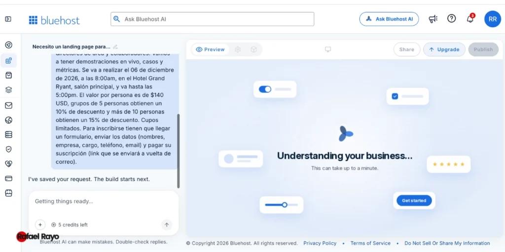
A specific description helps guide the first version. If your site needs a contact form, a schedule, a services page, or a way for visitors to request a quote, say so from the start. You can also add visual elements like your logo or photos, and share a reference site to show the style you like. The reference helps guide the design; it isn’t an invitation to copy another brand’s text or images.
When the first version appeared, I focused on three things: whether the content represented the project well, whether the main action was easy to find, and whether the look matched what I had in mind. I was surprised by how quickly it created the website and how much of the information I provided it included.
The first version doesn’t have to be the final one. The interesting part of the process is being able to request changes in chat and see how the site changes. Instead of starting over, I tried a more specific instruction: “Change the colors to a more modern palette and update the images, too, so the site looks more modern.” For example, you could ask: “Make the appointment request button more prominent and adjust the tone of the copy so it feels warm and professional.”
After that adjustment, I saw that it made exactly the changes I requested, and the final result was ready very quickly. If something doesn’t look right, it helps to describe the change specifically: which section should change, what it should communicate, and which element should stand out. “Improve the page” leaves a lot open to interpretation; “Move the form to the bottom of the services section and change the button text to ‘Request a quote’” gives clearer direction.
Before publishing, I looked through the site as someone unfamiliar with the project would. Is the main headline clear? Is the most important information easy to find? Is there a clear way to get in touch, make a reservation, or ask for information? I also reviewed the copy carefully, since an automatically generated page may need edits to its tone, names, hours, prices, or service details.
Then I checked the desktop, tablet, and mobile views. It’s easy to focus on a large screen and forget that many people will visit the page from their phones. When I reviewed those views, I found that the site adapted to the screen without any issues and its layout looked great. I checked especially that the buttons were easy to tap, the headings weren’t cut off, and the important images looked good.
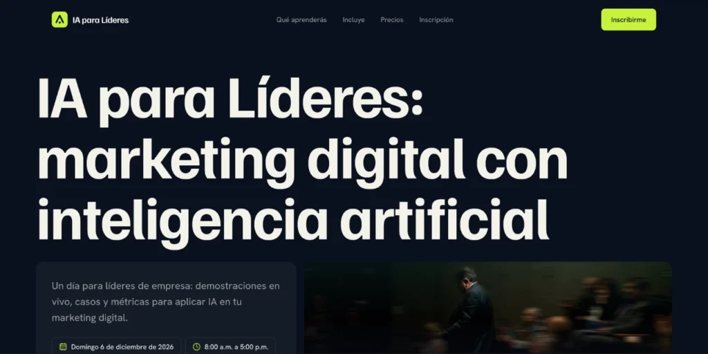
This review also helps you decide which changes are worth requesting. You don’t have to change every detail on instinct: first identify anything that could confuse a visitor, then ask for a specific revision. In my test, the most useful change was updating the colors to make the site look more professional and modern.
Before you get started, check how the plan you’re using works. Bluehost AI Builder offers a free plan that, according to the product’s current information, doesn’t require a credit card and lets you publish on a Bluehost subdomain. The pricing page says the Free plan includes five credits a day, up to 30 per month. The tool’s clarifying questions are free; the messages you send to request work use credits.
That makes it helpful to start with a reasonably clear idea and group the changes you want to request. Credits are used for building and editing requests; running out doesn’t mean your site disappears. According to the product information, if you reach zero credits, new changes pause, but the site you’ve already published stays online.
Pricing is “$0 to start, no credit card” or “paid plans from $20/mo.” With the Free plan, your site is published on a Bluehost subdomain. You’ll need a paid plan to connect your own domain. Review the current prices and terms on the checkout screen before choosing a plan.
Based on what I saw, Bluehost AI Builder may be a good fit for someone with a website idea who isn’t sure how to turn it into a structure, pages, and initial copy. It can also help create a first version that you can review more carefully afterward. Its usefulness will depend on the project’s complexity, how clear your instructions are, and how much editing you’re willing to do.
I wouldn’t present it as an automatic way to get customers or appear at the top of search results. A page can include titles, descriptions, headings, and alt text for images, but that doesn’t guarantee search rankings. Content, competition, location, and many other factors play a role. It’s a good idea to check every piece of copy and make sure it accurately describes the business.
My biggest takeaway was that the quality of the result starts with how clearly you explain the idea. A short instruction can get the process started, but explaining who you are, what you offer, and what action you want visitors to take gives the tool better direction. Then you can refine the page step by step through chat, as long as you know what you want to improve.
My test produced a first version of a site I need for my work, and it turned out really well. I still need to make a few adjustments before publishing, but the chat is very useful for that. What I appreciated was that it did exactly what I asked and made the specific changes I requested. It doesn’t replace human review: before sharing the site, you still need to check the information, tone, links, forms, and experience across different screen sizes.
If you have an idea and want to explore a first version, you can get started with this great tool, Bluehost AI Builder.
#sponsoredbybluehost